A night light board that facilitates meaningful connection with loved ones from a distance.
This project was done as part of the Prototyping Studio course for MHCI+D. For this project, we were tasked to design a product that would facilitate social connectedness in an isolated world. In addition to this prompt, our product had to have both a tangible physical interface along with a digital interface and one of our stakeholder groups needed to be children.
Due to the pandemic, many people have been separated from their loved ones for months on end, leaving them with feelings of loneliness and the desire to connect with their loved ones again. This separation has been particularly difficult on children, as socialization is especially critical for them at this time in their lives. They may also find it extra difficult to cope with not being able to see their friends as they are still learning to regulate their emotions.
We aim to devise a novel and fun way for children to connect meaningfully with their friends and loved ones during this time of isolation, while thinking beyond the screen and conventional methods of communication.
Stellar is night light board that allows people to multi-modally communicate and meaningfully connect with their loved ones from a distance using the metaphor of constellations in the night sky.
Stellar is a night sky-themed light board that allows loved ones to communicate with each other through abstract messages in the form constellations. Messages sent by loved ones display on each other's boards, allowing them to feel the other's presence even when they are physically far away.
A website accompanies the physical board. Through the Stellar website, users can connect with their friends and loved ones to send and receive messages. The website is also where users craft messages to send to their loved ones.
While it is recommended to have the physical board for the fullest experience, the website offers a digital version of the board. With this option, users can still enjoy Stellar even without the physical board.
Users send messages to their loved ones in the form of constellations and animations. Through the digital interface, users can design their own constellation pattern or select a preset animation. Once sent, the constellation or animation will show up on their loved one's board.
When it's time to go to bed, the board goes into Night Light mode. In Night Light mode, the user's board displays a unique constellation made up of stars that represent each of their loved ones who are connected with them. It serves as a reminder that your loved ones are always with you, even if they are physically far away.
To start off, we did a bit of background research. We collected and reviewed 26 papers on previous work done in the space of technology-mediated social connectedness to get inspiration for our own project. We analyzed each work and then drew out some high-level themes.
View full Background Research docUsing our background research as inspiration, we brainstormed our own ideas for technology-mediated solutions for social connectedness. As a team, we generated 63 concept sketches in total.
We started the downselection process by dot voting as a team on ideas that we thought could be interesting to explore further, while also keeping feasibility in mind. After dot voting, we were left with 23 concepts.
To help us downselect further, we parsed the remaining concepts in several different ways. We placed concepts onto a prioritization matrix to rate each on feasibility and desirability. We also sorted concepts by high-level themes or categories. We also each picked out 3 concepts that we were personally most excited about.
We ended up with 10 concepts that we then polished up, giving a description of what each concept is as well as a description of how the interaction might work. These 10 concepts were then shared with the rest of our class. Our peers and instructors dot voted on their favorite concepts of ours and provided feedback.
From this peer input, we narrowed down the 10 concepts to our final 2, which were the Constellation Night Light and the Pregnancy Belt. The Constellation Night Light was our most popular concept. The Pregnancy Belt was not quite as popular, but we decided to pursue the idea further because of the intimacy of pregnancy and potential for cross-generational connection.
To better convey these two concepts, we created video prototypes for each. We came up with a short script for each, which I used to sketch a few storyboards to help plan out our shots. We filmed our footage and recorded voiceovers and produced our two video prototypes.
UW KidsTeam generously participated in two participatory design sessions with our team during this project. UW KidsTeam is made up of children ages 7–11 and the adult faculty and graduate students who work with the children.
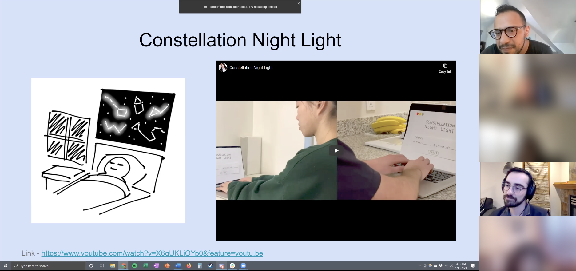
For this first session, we wanted to gauge which of our two ideas was more appealing to children. Our plan was to show the KidsTeam members our two video prototypes and elicit feedback through discussion questions. We prepared a Google Slides deck so that the children could type or draw out their thoughts. The adults on KidsTeam assisted the children and also provided their own thoughts.
View full Co-Design Session 1 deckChildren were interested in sending word-based messages with the Constellation Night Light.
Children were interested in using the Night Light during all times of the day, not just at night as originally intended.
Both the children and adults asked questions about operating details such as the possibility of different colors, how the board would behave if the room was constantly dark, and when the board could be used.
There was a concern that children might stay up past their bedtimes playing with the Night Light.
The children were concerned about the vibrations possibly interfering with activities and proposed having the vibration strength be adjustable.
They also proposed different forms of the receiver wristband (e.g. a legband instead of a wristband).
Both ideas were generally well-received, but there seemed to be much more interest toward the Constellation Night Light.
Children were still curious about the Pregnancy Belt, but lacked the experience and knowledge about pregnancy to feel more interested in it.
Since there was a more universal interest in the Constellation Night Light, we decided to move forward with that concept, which would come to be known as Stellar. We began to think about shifting the board function from a more passive experience to a more active one. We also began thinking about having daytime and nighttime modes so that the board could be used at any time of the day but wouldn't pose as a distraction at night.
With our final concept chosen, we reworked our previous Constellation Night Light storyboard and fleshed out a more detailed scenario in which the product would be used. We created a new storyboard for Stellar to illustrate this scenario and the key interactions within it.
For this storyboard, we imagined this scenario of a young girl celebrating her birthday, but she finds herself missing her grandfather and friends who couldn't be there. Her grandfather sends her a Stellar board for her birthday, which she sets up on the computer. On the computer, she connects her grandfather and friends to her account. She creates her own constellation design and sends it to her grandfather. Her grandfather receives her constellation on his tablet. He decides to send something back, so he selects a shooting star animation to let his granddaughter know that he misses her. The girl is delighted to see the stars that her grandfather sent on her Stellar board. At nighttime, the girl sleeps below the light of the Stellar board, with shining stars representing each of her loved ones.
From there, we began working on the website design. We had already made a simple paper prototype of the interface for the video prototype. Using that as a starting point, we expanded and fleshed out more of the information architecture for the website.
We created a Wizard-of-Oz prototype to test the experience of sending constellations and messages through the website interface—specifically, the following interactions:
Creating a custom constellation
Selecting a preset constellation design
Customizing constellation colors
Displaying a scrolling LED message (to try out a word-based messaging option)
Our test setup involved a mock website interface on Miro and an output “board” on Figma. The Miro board would be pulled up on the computer, while the Figma board would be pulled up on a second monitor or screen. The Tester would interact with the Miro interface while the Wizard would manipulate the Figma file in the background, updating it with the Tester’s inputs and giving the illusion that the board was updating itself.
We did a practice run of the test before conducting the test with our actual participants.
Drawing may not have been the best way for participants to make their constellations. Participants created complex line drawings that didn’t end up translating well into dot patterns. Clicking dots would be more representative of the actual experience.
It wasn't very clear that there was an option to select a preset constellation design because it wasn't directly labeled.
Being able to customize the lights with colors was highly desirable.
Those who weren't confident in their drawing abilities enjoyed having the preset constellation option.
More choices for the preset constellations would be nice to allow for more expression.
Doing a practice run before conducting the study on the actual participants was helpful for the Wizard to practice manipulating the prototype.
The design of the study was not as representative of the actual experience we were envisioning. It would have been more accurate to have one person sending a message to another person in a different room.
Participants brought up an important consideration that there should be specific features for users to limit who can engage with them.
We worked with UW KidsTeam once more for a second remote participatory design session. At this point, we had further refined the visual design of the interface. We had also decided to not move forward with the word-based messaging option due to it not being feasible to implement on our physical artifact as well as it starting to detract from our original visions and goals for this product. As such, our main objectives for this participatory design session were:
Testing the experience of designing constellations on the grid
Determining whether to arrange the lights in a regular grid vs. an irregular grid
The interface mockups were placed on a Miro board, where the participants could mark up the mockups with the drawing tools.
Although we intended for the children to only color in the dots on the grids, they still ended up drawing lines.
Children tended to draw specific objects and symbols rather than abstract designs.
The children expressed that they did prefer creating their own patterns rather than picking one from a selection, suggesting that they wanted to be intentional with their messages.
Children seemed to prefer not having a grid at all. They wanted to draw whatever they wanted and felt restricted by the grids.
Adults seemed to prefer the irregular grid.
It was difficult for the children to use Miro. It took time for them to learn the interface and they would get distracted by the platform.
It may have been better to do an activity that had the children think more about creating a message that they would send to a loved one (e.g. a roleplay scenario where they send a message to their grandparents).
Users who do not have an account yet or are logged out will see this informational landing page when visiting the Stellar website.
Page provides a brief description of Stellar and how to get started with the product.
Testimonials at the bottom so people can read about other users' experiences with Stellar.
Multiple calls-to-action on the page to prompt visitors to sign up for an account.
When a user wants to send a constellation to a friend, they are given the choice to Create a Constellation or Send an Animation.
The Create a Constellation option allows users to design their own custom constellation pattern.
User creates their constellation by clicking on the dots on the grid. The dots they select are the lights that will light up on the board.
Can change the color of the constellation.
When the user is finished designing their constellation, they select the friend they want to send their creation to. Once sent, the constellation will appear on their friend's board.
The Send an Animation option allows users to select from animated presets.
Each animation has a message associated with it. (e.g. Shooting stars = "I miss you!")
Can preview the animation on the mini grid on the right.
After choosing an animation, the user selects the friend they want to send their message to. Once sent, the animation will appear on their friend's board.
User's profile page contains their account information and settings as well as a digital version of their board.
Profile page is purely internal-facing.
User does not need a physical board to use Stellar. They can still receive constellations from their digital board.
If user does have a physical board, the digital board is synced with their physical one.
Toggle control to manually switch between Freeplay mode (can freely receive messages from friends) and Night Light mode (only display Night Light mode constellation).
User can change the color of their star that represents them on their Night Light mode constellation and their friends' Night Light mode constellations.
I took charge of making the physical night light board. As part of the course, we were provided an Adafruit Circuit Playground Express microcontroller and a set of basic electronic components. For our project, however, we needed a larger quantity of LED lights, so we purchased some additional materials.
Drawing from my prior electronic prototyping knowledge, I determined that the easiest way to construct the night light board was to use NeoPixel strands, which would allow for individual control over many lights while only requiring the use of a single microcontroller pin. In addition, they would be easy to program since there were existing NeoPixel libraries with functions to easily control the lights. I constructed the circuit using Adafruit's NeoPixel guide as a reference.
After testing the circuit, I mounted the lights onto the backing board, which was simply a piece of cardboard with holes poked through it. While it would have been nice to have a more polished backing board made of plywood or acrylic, access to makerspaces was limited at the time due to COVID safety restrictions.
The code for the board was written in MakeCode, a block-based code editor for the Adafruit Circuit Playground Express. I wrote functions to display a static constellation pattern, twinkling stars animation, and shooting stars animation.
View full MakeCode codeWe would have liked to have built out a fully functioning digital interface to control the physical board, but due to technological limitations and time constraints, we opted to focus on conveying the idea and story around the design through our video showcase.
There were also quite a few interaction details that we as a team discussed at length throughout its development but didn’t quite make it into the final showcase of the project—details such as different operational modes, parental controls, and amount of customization, to name a few. Getting those a bit more fleshed out would also help us to refine the digital interface a bit more.
We’d also be interested in exploring different forms for the physical board. For example, we had heard from a guest critic during an in-class feedback session that round shapes tend to be more appealing to children, so doing further research into this and testing different shapes and sizes of boards could be valuable.
There would be quite a lot of testing to be done overall, but in particular, we’d like to test our product across multiple age groups. We wanted to design a product that could be used cross-generationally, from children to older adults, but during the time this project was in development, it simply wasn’t feasible to do more extensive testing due to COVID safety concerns.
One of the biggest things we learned from this project was to make sure we were testing what we actually intended to test. Due to the circumstances, we had to get pretty creative with our testing setups, but there were times where the setup we designed wasn’t really 1:1 with the interaction we were trying to test. For example, with our Wizard-of-Oz prototype, the test would have been more accurate to have a message sender and message receiver in different rooms. And in both our Wizard-of-Oz and co-design sessions, our participants would draw lines on the grid to create constellations, but the actual constellation would only be made up of dots.
Going off of the early feedback we received from UW KidsTeam, we tried to incorporate the children's desires to have a word-based messaging system. However, implementing this on the physical board was not feasible for us. Even still, we kept thinking about ways we could incorporate word-based messaging and got hung up on this issue for quite some time. Eventually, we ended up scrapping word-based messaging entirely.
We were given feedback by industry professionals during class critique sessions that if we were to incorporate word-based messaging, it should be distinct from other existing products. We felt that we would not be able to make this feature stand out enough from texting and instant messaging. Instead, we decided to lean more into the concept and metaphor of constellations and finding meaning and emotion in these abstract star patterns.
From this experience, we learned that what stakeholders want (or think they want) isn't necessarily what's best for the design.